Designing
a new shipment
transaction And Management platform
Infor LN is a leading ERP in the automotive, aerospace & defense and electronics industries used for managing manufacturing, supply chain and logistics. The product’s shipping module was outdated and a major pain point among customers was several unnecessary steps and processes to manage shipping activities. Together with the LN product management team and a UI designer, we redesign the LN shipping module with enhanced usability and efficiency in mind.

Responsibilities
I was responsible for the research, problem definition and overall design solution. I owned reverse engineering and documenting the product’s current state, defining a user research plan, conducting user interviews, defining which flows to illustrate with designs, and wireframing. I later worked with a UI designer to implement to optimize styling decisions.
Tools / Skills
• User Research
• Wireframing
• Product analysis
• Design documentation
• Design QA
Process

DISCOVER
Context & Challenges
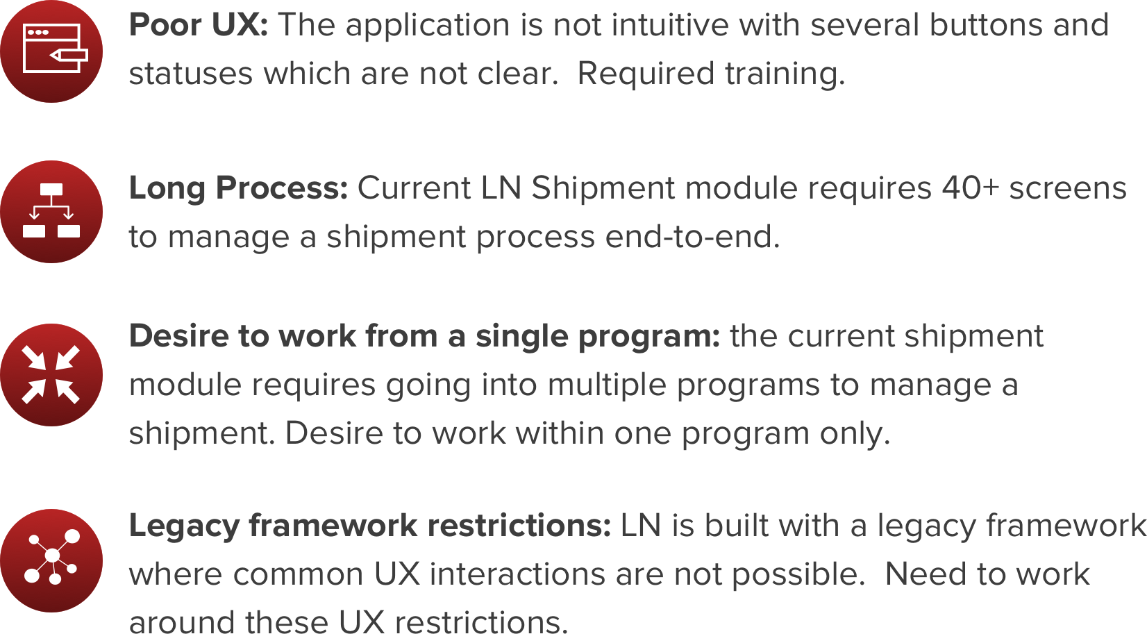
Product & Shipment Process Analysis
In order to get familiar with the product and process we were designing for, I went through recordings of product demos taking screenshots of each screen and step required in the process - documenting what information was displayed and statuses available. I also documented the greater end-to-end shipment process indicating which LN programs were being used in the process. This would be important since the new product we would build would need to call these programs for managing and executing shipments.


Market Research
In order to get inspiration to see what other shipment transaction management tools were out there, I did a search of other tools and applications. While I ultimately could not find a truly inspiring product, there were elements of various different programs that could provide a better user experience with visualizing shipments and the stages they were in such as a Gantt chart view of shipments. This inspiration later helped drive some of the ideas I ultimately delivered.

User Research
In addition to product and market research, my team and I did a customer site visit to get first hand insight on how they use the product and what type of feedback they had. This was helpful because they had come up with creative ways to work around product UX issues. Observing how they work also helped us get a better understanding on their workflow and other tasks and information they need to do their job. This helped me identify opportunities to lay out information and design processes that complimented the way they worked. After speaking with users, and recording notes and video on how they work, I synthesized these insights in an affinity mapping session with my team. Outputs were then put in a research report and user profile (persona).

Affinity Mapping

User Profile
One of the key insights we received about the user (shipment managers) in our user research was that they spend about half the day away from their desk checking the status of shipments and where they are in the facility. They would then take a printed sheet of the shipments with them and check off all the ones that were in order, and note those that were not. They would then go back to their computer and release all the shipments ready to go. We realized a mobile tablet application for doing this could be highly useful. In addition to this we discovered that what shipment managers are looking for is an application with all the information they need in it without having jump between multiple applications.

Define
UX Goals

Challenges

Objective Metrics

User Flows

Develop
Wireframing
Since there were a variety of ways this application could be laid out, I experimented with a few different design approaches including a kanban inspired interaction metaphor, a Gantt chart to view shipments, a shipment progress bar and checklist. After sharing these with users, the designs that connected with the users most were the gantt chart view of shipments and a checklist on each shipment indicating what steps had been completed. After this, I continued to refine and validated designs until handing off my wireframes to a UI designer to apply theming.

Feedback

UI Design
Once flows and wireframes were validated with users, I worked with a UI designer to apply the Infor Design System (IDS) to add theming to the wireframes. We then turned these into clickable prototypes and annotated designs for handoff to developers who would use these assets to code the application.


Deliver

Shipment Gantt View
The shipment Gantt view shows shipments represented as pill shapes with a status association in a timeline. Shipments approaching the current time indicate those shipments that need to move out. When a user click on a shipment line, it will pull out shipment details from a side panel where the user can take various actions on the shipment.
Shipment Detail View
The shipment detail view shows various details about a shipment and various actions the user can take. The shipment detail view also features a checklist to show at what stage the shipment is in. The user can click into the checklist to have visibility on all the documentation and steps previously taken.


Shipment Calendar View
The shipment calendar view offers an alternate view of shipments from the Gantt view. While the Gantt view is great for viewing daily shipments, the calendar view offers the user a longer term schedule of shipment by day. Clicking on a shipment will pull out shipment detail from a side panel.
Shipment BI
The automotive shipment workbench also features some analytics to help the user get a sense of their status and workload. This would help them give visibility into the future on freight they will need to arrange, and potentially bring in additional help if there are a lot of shipments to manage.

Handoff Documentation
Since development was to be handled by a separate team in India, we produced handover documentation to walk engineers through the various features and functionality of the application. We produced detailed annotated designs of five workflows that would illustrate the full functional needs of the app. We also sent over UI specs to guide the styling of the application. In addition to the handover documentation, we conducted weekly calls to answer questions and QA dev.


Impact
Following product development, we conducted user tests on the legacy design versus the newly developed design with 30 users using the same tasks. The new design yielded significantly better results than the original design in user satisfaction and task completion time.

Conclusions & Lessons Learned
This project was interesting and also challenging to work on because it required becoming an expert on the complexities of managing shipments, and there were few products out there to take inspiration from. As a result, this project really required experimentation with a variety of approaches to drive an effective design solution. Furthermore, what also made this project challenging was the framework UX limitations and the complexities of the different systematic steps and processes involved to manage shipments. On the UX front we were in many cases restricted from using common and seamless UX interactions. Designing for the system on the other hand required a lot of time going into the core system and checking that we were accounting for all systematic requirements. Taking into consideration the UX limitations and systematic challenges, the ultimate design functioned and made users very happy - since it was a significant upgrade from the legacy product. Overall this project strengthened my skills as a designer, especially in terms of designing with restrictions and complexity.